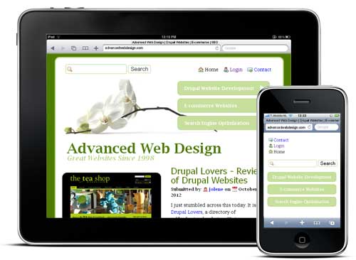
Responsive web design is the approach where your website (ie. your Drupal theme) is designed in such a way that it alters its design and layout to accommodate viewing on different devices. For example, the design may include a large background image when viewed on a full size computer, but that image is dropped, it responds, when viewing it on a tablet device or smartphone.